An overview of blocks in the design system.
Kitchen Sink
H1 – Headline
H2 – Headline
H3 – Headline
H4 – Headline
H5 – Headline
H6 – Headline
Body text
Wayfinding cards – 3 or more cards – No button/CTA – Whole card is clickable
A short description field.
Wayfinding cards – 3 or more cards – White, blue or yellow colorway
A short description field.
People Cards – Youtube Shorts – Blue or white colorway
This block can display up to 3 Youtube Shorts.
Name
Additional Text
Name
Additional text
Name
Additional text
Info Cards – Blue or white colorway
This block is a place to display a short intro paragraph alongside some supporting facts or stats. You can display a maximum of four supporting items below this intro text.
Item 1
Item 2
Item 3
Item 4
This is a pull quote – The main body of the quote goes here. Don’t include the quotation marks!
Name, Location, etc.
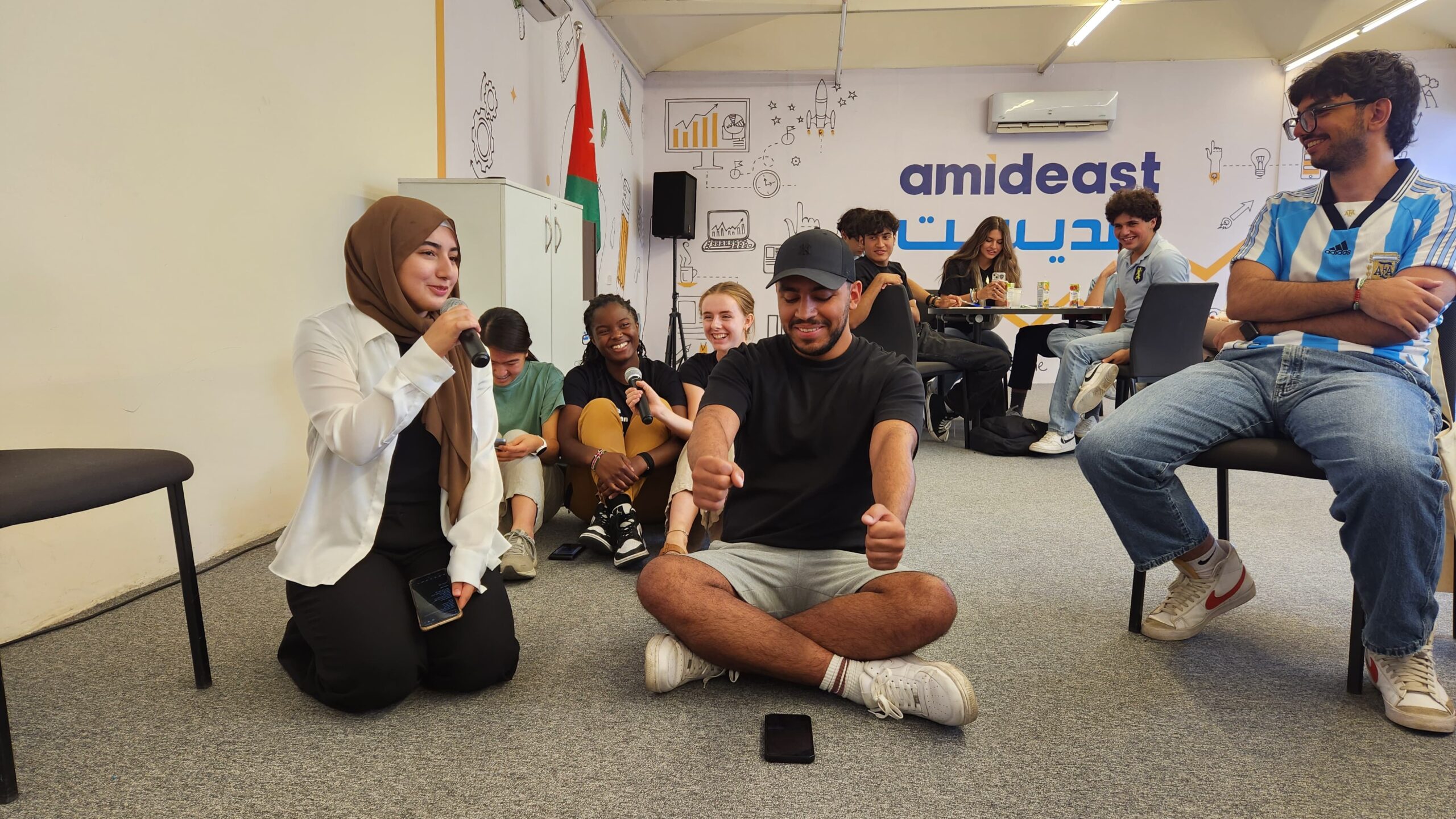
Image and Text – Left Image – Blue or white colorway
This is a place to share a brief paragraph. The font size is larger than your body copy, so you will want to avoid overloading the block with content.
Image and Text – Left Image – Blue or white colorway
This is a place to share a brief paragraph. The font size is larger than your body copy, so you will want to avoid overloading the block with content.
Image and Text – Right image – Blue or white colorway
Lorem ipsum dolor sit amet, consectetur adipiscing elit. Nullam id dolor id nibh ultricies vehicula ut id elit. Cras justo odio, dapibus ac facilisis in, egestas eget quam.
CTA – Alert Style with blue border – White Colorway
This block is intended to showcase alerts or deadlines.
CTA – Blue Colorway
Example of a CTA block in the blue colorway
CTA – Yellow Colorway
Example of a CTA block in the yellow colorway
Accordion
Supporting text for the accordion item
Supporting text for the accordion item
Supporting text for the accordion item

Callout Card
Supporting text for the callout card. These cards are intended for use within stories.
Callout Card
Name: Ava Aslinia
Programs: Virtual NSLI-Y (2023), Summer Jordan (2024)
Program language: Arabic
Alumni Representative location: Virtual
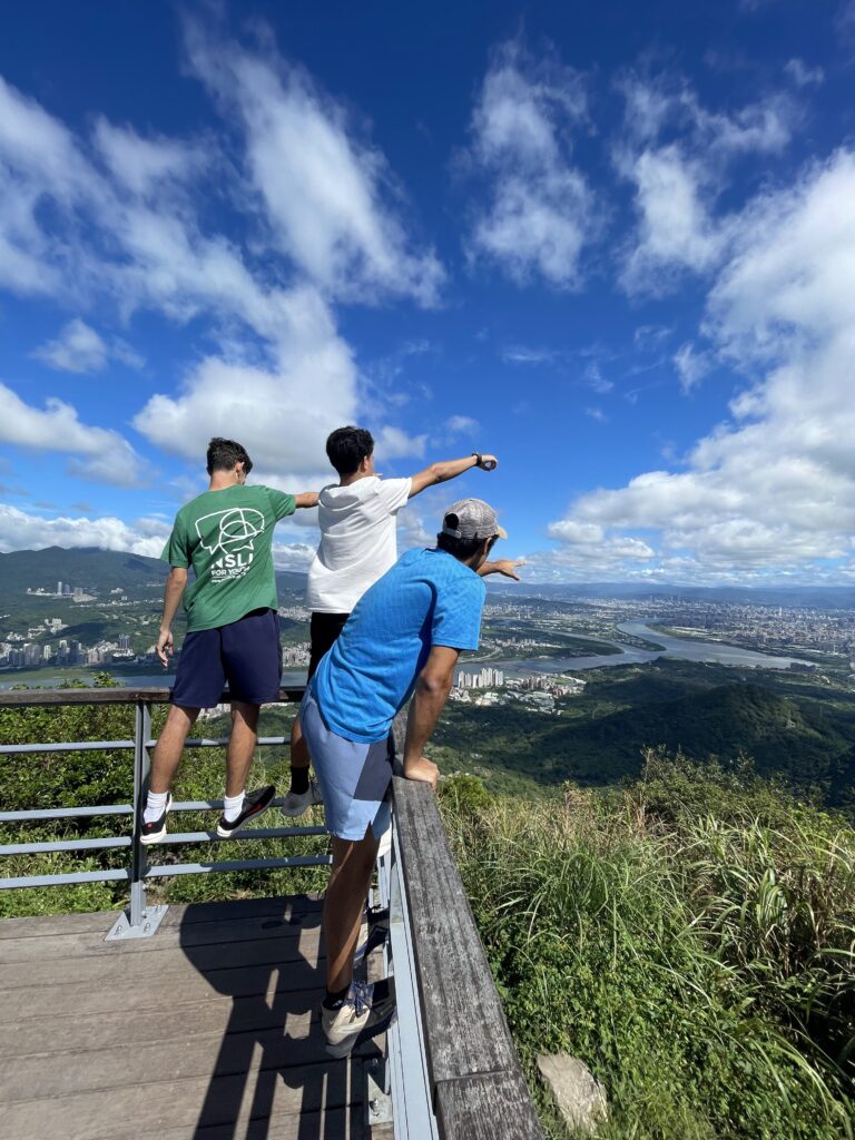
This is an example of an image with caption.
This is an example of a video (youtube embed.)
This is an example of two buttons. You can pick the style.
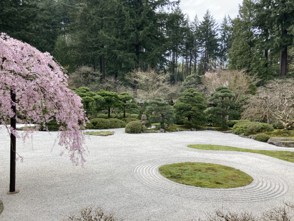
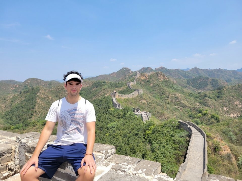
This is an example of a gallery with 4 images.

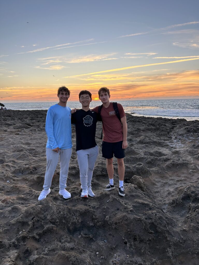
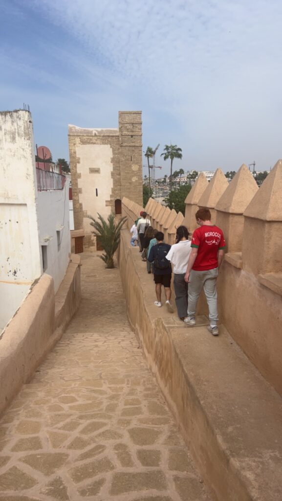
This is an example of a gallery with 3 vertical images.
 U.S. Department of State

